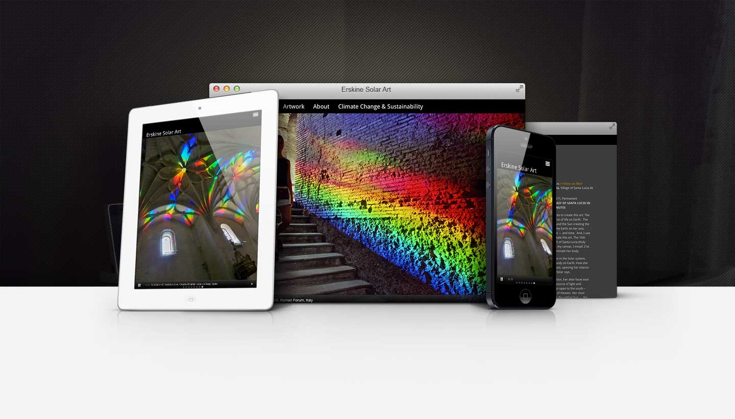
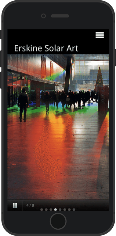
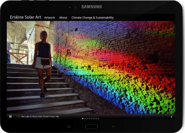
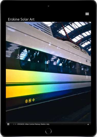
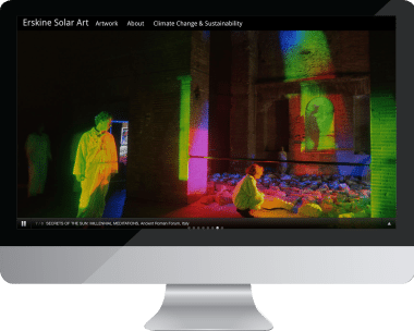
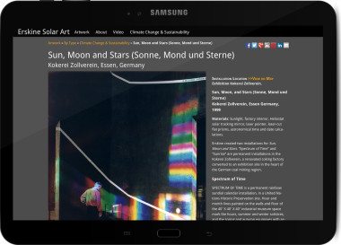
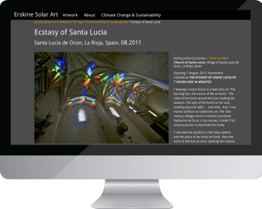
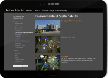
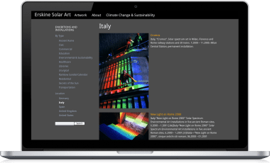
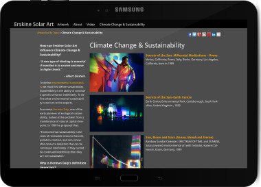
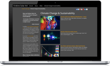
When developing this WordPress theme to showcase international artist Peter Erskine’s solar light installations, the artwork needed to come first. The beautiful full-spectrum light installations in his photos didn’t just need to dominate the design. They needed to BE the design. With that in mind, I designed a minimalist user interface with a color-neutral palette that allowed the colors of his work to stand on their own. The front page welcomes you by immersing you in a full-screen slideshow of his work. The monochromatic palette ensures that nothing distorts your perception of Erskine’s artwork.
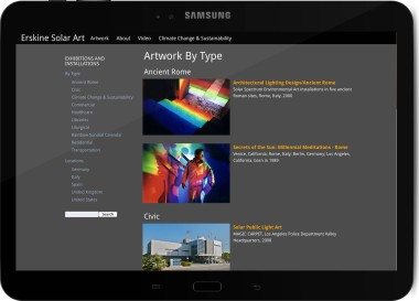
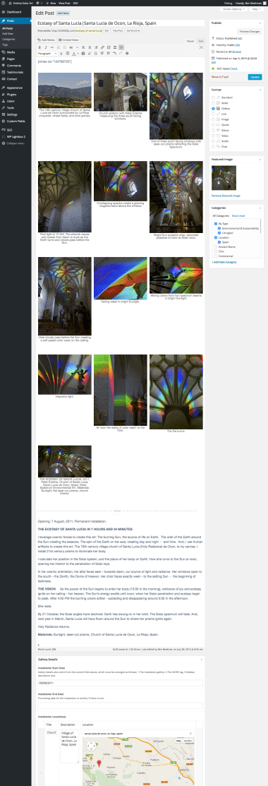
I developed a system that made it easy to organize Erskine’s work by installation, geographically, chronologically, and by type. I created new fields to organize information that standard WordPress posts don’t contain, and developed a context-sensitive admin interface to manage the installation information.
I added these new fields into an expanded gallery post format template that allowed him to organize all of his installation information intuitively. That information included dynamic Google maps on each gallery post showing the location(s) of the installation(s) associated with the work.
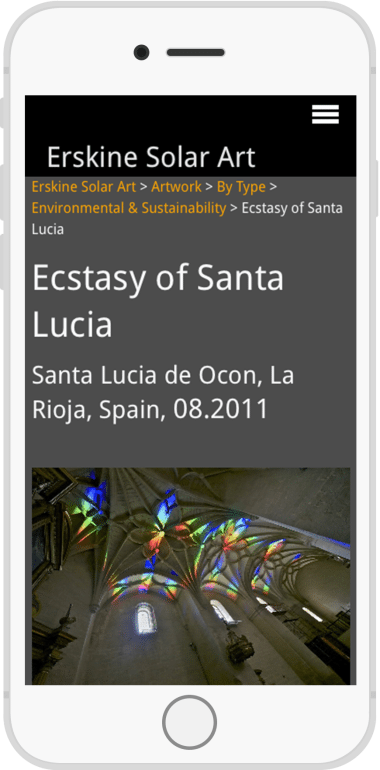
Erskine spends most of his time working with models and mirrors, not in front of a machine, and prefers his phones dumb. After some explaining, he embraced the importance of the mobile-first responsive design approach I take with my sites. I took care to ensure that his site was just as usable and attractive on phones and tablets as it was on a computer screen.
Because of Erskine’s mild aversion to computers, I knew that I had to make the job of managing and adding content as easy as possible despite its complexity. It was soon clear that I succeeded— Erskine quickly grew comfortable with the administration of his heavily customized gallery templates. I took pride when he marveled at the power and simplicity I’d brought to the process of content creation.
